"Don't judge a book by its cover" has never been an idiom that has resonated with me. I'm the first to admit that I buy wine based on their labels. My excuse is that I'm a graphic designer. While we’re in the confessional booth, I might as well own up to enjoying the wine Instagram community and occasionally choosing labels for their Instagrammability.
Having confessed to my sins, as a wine enthusiast, I've noticed a correlation between the artistic skill, consideration, and intention of a beautifully designed wine label and the contents inside. Great design communicates a message and tells a story.
In a sea of beautiful designs, what catches your eye and whose story tempts you to try something new? Sometimes I wonder whether labels are created to tell their own story or whether they are designed to appeal to their target market? TLDR: The answer is, inevitably, a bit of both.
Branding the wine and the consumer
The Chartered Institute of Marketing defines brand as "The set of physical attributes of a product or service, together with the beliefs and expectations surrounding it - a unique combination which the name or logo of the product or service should evoke in the mind of the audience.’"
The goal of any wine brand is to ultimately create a profit, be that through volume or value or both. It relies on attracting new consumers and, hopefully, retaining brand loyalty. Branding most definitely includes the label; often the first introduction and impression of the brand.
We know that the market can be divided into high-involvement consumers and low-involvement consumers, each with differing buying habits. High-involvement consumers value the intrinsic characteristics of the wine inside, as well as appellation, winemaking techniques, vintage, etc. Low-involvement consumers lean more on the extrinsic qualities such as price, label, awards, etc.
Wine Intelligence work across 35 wine markets and regularly releases their Wine Portraits reports. These reports group consumers into segments based on their wine drinking behaviours, with categories such as:
- Kitchen Casuals: An older segment with limited wine knowledge and who don’t drink often.
- Senior Bargain Hunters: The oldest group who drink infrequently but have a high level of wine knowledge.
- Social Newbies: The youngest with limited knowledge but who drink often and will spend money.
- Engaged/Adventurous Explorers: They have the strongest wine knowledge, drink frequently, spending the most money on wine from a wide repertoire.
- Generation Treaters: A younger market who drink the most frequently, albeit mid priced wines, have less wine knowledge but are expanding their knowledge.
- Mainstream Suburbans/Mature Treaters: A mid to older category with high levels of wine knowledge, drink frequently, but don’t spend much per bottle.
It is interesting to question whether these academic exercises translate to the real world. It is also amusing, as a consumer, to realise that these categories exist and ponder where, if at all, one fits.
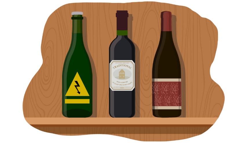
Labels can be divided into 3 categories
Browsing boutique and online wine stores[2], it's clear that labels can be divided into 3 broad categories: outrageous, traditional, and modern.
1. The Outrageous
[‘very bold and unusual and rather shocking’]
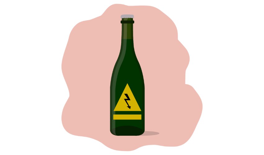
We’ve all raised our eyebrows at an outrageous label design; often synonymous with the natural wine movement, and always demanding attention. New producers recognise the limitations of breaking into a competitive market already secured by established brands and their customers. It is understandable that these young labels are designed to stand out - on the shelf, on the table, and on social media.
They are often small volume productions, which allows them to take greater risks (with varietal, winemaking and marketing choices). It makes sense to express themselves and their stories through their packaging, and often become an extension of the community with whom they surround themselves.
Younger generations have grown up surrounded by well designed products (throw a cork in the air and, especially in Cape Town, chances are that it will land on a creative) and they are more likely to consume wine in a social setting where the label choice may hold as much importance as the contents of the bottle.
These brands are undoubtedly targeting a younger market who will, hopefully, become their loyal tribe - but are they also intentionally bypassing the Mature Treaters; already accepting that established consumers are more hesitant to experiment? Is some of the more adventurous artwork too divisive? Or does it allow for interpretation by the consumer, promote a memorable conversation, and ensure that there is something that appeals to everyone?
A brief [de]tour through second labels
Second labels, especially in New World countries, often have a more casual and fun feel to them. They serve the dual purpose of being the early drinking alternative while we wait for the big guns to mature, as well being an affordable introduction to a potentially long term relationship with the new consumer. But let’s be honest, all emphasis (and budget) is still placed firmly on the potentially award winning, super premium wines that only a handful of us can afford.
It works both ways.
We’ve seen ‘young’ brands who’ve initially launched with eye-catching and sometimes outlandish labels go on to later release wines with more reserved designs that appeal to a broader and more informed audience. These often correlate with age-worthy wines that are more costly to produce; an intentional response to broadening their potential market.
2. The Traditional
[‘existing in or as part of a tradition; long-established’ and ‘habitually done, used, or found’]
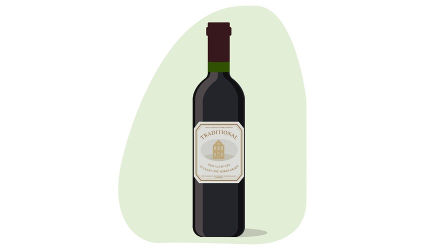
As for those aforementioned big guns; European influenced, foiled, spot UV varnished, embossed, using typefaces that predate computers. Are they nostalgic? Yes. Who doesn’t covet a vintage collection of 70s SA blends…sans any indication of ABV (not because the label has disintegrated in a charmingly authentic way but because, back then, we all agreed that booze is booze).
Are they familiar? Yes. But do they kinda all look the same and verge on being ubiquitous? Before you answer, let me introduce you to wine label bingo: give yourself a point each time a label displays a manor house, crest, metallic foiling, embossing, serifed type, calligraphic type, or references its founding year on the front label.
History and heritage is important… But these labels unnerve me. I'm distinctly aware that these brands, often with long-standing reputations for high quality premium wine, don’t entice me and are (intentionally?) not speaking to me. And that’s okay - I don’t even know which wine segment I belong to! That doesn’t stop me from questioning the message they are trying to communicate in this day and age. I believe that they believe they’re relaying: reputation, prestige, heritage… All I see is wine bingo, a choke-hold on tradition and, as I get older, increasingly hard to read font choices obscured behind the glare of varnish and distorted by the texture of embossing.
Reputation and quality should always triumph over pretty design. But pretty designs help (thank goodness - it means my job is safe). One of the hardest design briefs is refreshing a long-standing brand with loyal customers.
Which leads us to barrel number three:
The Modern
[’relating to the present or recent times as opposed to the remote past’ or ‘a person who advocates or practises a departure from traditional styles or values’]
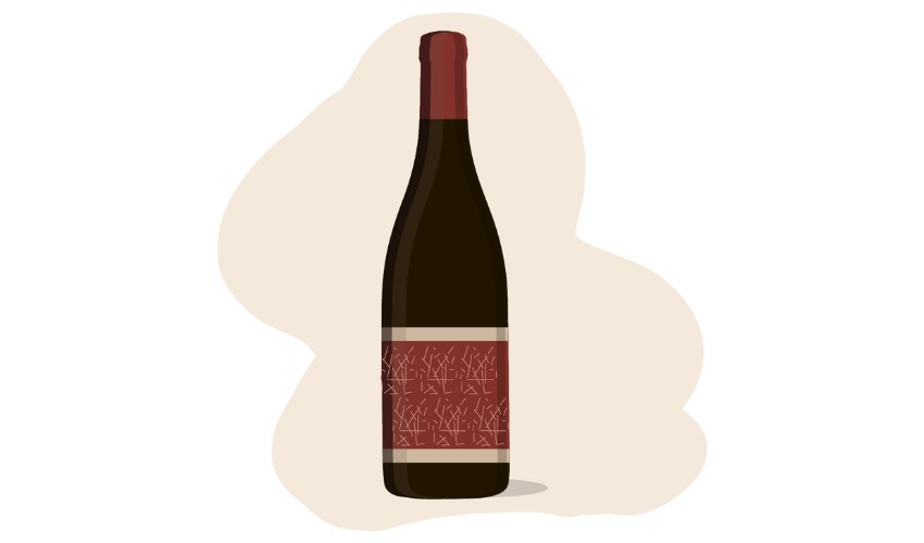
One has to admire brands who, together with their design team, are able to find the balance between traditional and outrageous. In particular, brands who are willing and able to retain their sense of history whilst welcoming a new audience. They’re the most likely to win label design awards…and the least likely to cover their labels with award stickers.
Beauty is in the eye of the beholder
Now feels about the right time to drop in a second idiom and disclaimer: “Beauty is in the eye of the beholder”. Art is subjective. Wine labels are art - three words: Château Mouton Rothschild.
And so I asked a few of my wine friends.
Out of the 37 replies to my request for them to ‘shout out some of your favourite wine labels… NOT your favourite wines’, all but two offered labels that skirt between outrageous and modern. One mentioned a design that certainly counts as modern, but draws heavily on traditional influences. The second outlier suggested multiple options of which only one of his examples leaned towards the traditional…a Cap Classique…the greatest exception to this train of thought as they just work so very well with their traditional labels.
(It should be noted that everyone is a knowledgeable wine consumer and many work in the industry. Most are under 40 years old. To counteract this I checked with 6 friends…who also struggle to find their birth-year wines!)
What struck me most about their answers was how each label - whether they focussed on imagery, minimalist typography, or were slightly more traditional - stood out on the shelf AND had an unmistakable timelessness that was forward-thinking and inclusive. Labels that, in my opinion, transcend culture and age. And yes, a few were ‘very good to outstanding’ wines. My wine friends could not stop themselves!
Should we judge a wine by its label?
Time and again we hear about the ‘declining wine market’. ‘Young people are drinking less wine than previous generations’. ‘How will we attract new consumers?’.
Well, who are these new consumers in South Africa and how might they view wine labels that often influence their purchases? In a country where we speak multiple languages and rely on a growing export market, it's smart design to lead with the image.
It’s interesting to return to the Wine Portraits to ask ourselves whether we, as consumers, are happy for market research to categorise us into segments that will be adopted to sell us more wine. My magpie designer eye will always be drawn to the brightly-coloured avante garde, because they challenge preconceptions and imply progression. I also acknowledge that there is comfort and safety in knowing what to expect from the traditional.
But my true appreciation is for the level of skill, intention, and consideration required to tell a story that bridges the past and future.
Perhaps it’s not fair to judge a 300-page book by its singular cover… But I think that, for the most part, one can effectively judge a wine by its label and the story it has to tell.