Four Cousins led the way in 2000, with the launch of three sweet, accessible and friendly wines. The brand gained huge traction and became a firm South African favourite. Twenty-three years and a few minor pack upgrades later, the time was ripe for a significant makeover.
The market has matured substantially and Four Cousins sought to connect with the consumer in a new and more meaningful way. Research was conducted and qualitative groups revealed a heart-warming connection to the Four Cousins brand and values shared. Respondents were equally vocal about their dislike of the existing packaging.
Unanimous research feedback highlighted that all wine packaging, regardless of price, should honour the ritual and sophistication that wine drinking brings. Drinking wine elevates even the most mundane of days. An occasion is not required for drinking wine, wine is the occasion. Glass in hand, every sip feels indulgent.
The Four Cousins brand team took note and chose Cape Town-based agency, Gentry Creative to realise the packaging dream.
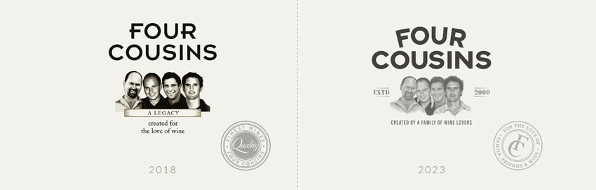
Gentry Creative approached the project through a consumer lens, maintaining the cousins illustration (which holds equity for the brand) but removing misaligned sentiments. “A Legacy” became “Created by a Family of Wine Lovers” and the “Finest Quality” seal became “For the love of Family, Friends & Wine”.
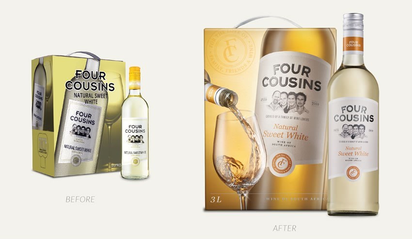
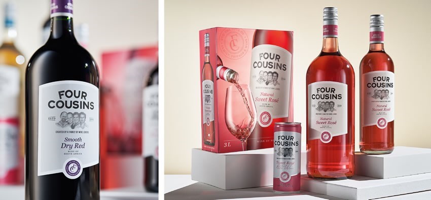
The new logotype with a curved application is friendly and contemporary. Gentry Creative upweighted wine credibility cues by replacing the photograph of the cousins with an engraved-style illustration (Doug Powell) and the addition of “Est 2000”. The previous white label is transformed by the soft buff background bordered with a fresh white edge. Contemporary fonts and juicy colours complete the look.
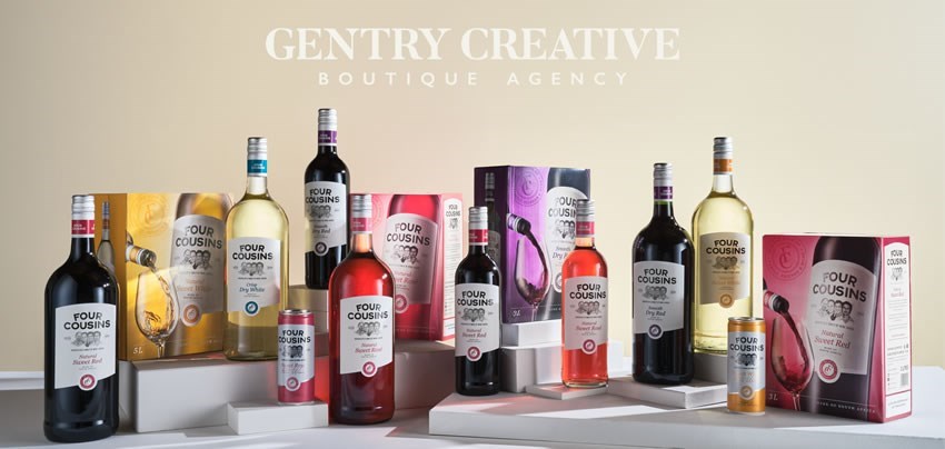
The boxed wine presented Gentry Creative with a billboard opportunity to ignite renewed interest in Four Cousins, leaning into consumer sentiment and presenting indulgence in the everyday. Each Four Cousins pack, with glass pour was shot individually; beautifully lit, styled and considered with the same respect and sophistication as would be afforded a luxury wine (Charles Russell, Visigrafi). Four Cousins is elevated, wine drinking is honoured.
Gentry Creative applied consistent brand architecture to the 250ml Can wine designs. Fresh white, silver highlights and satin matt sweet variant colours support a crisp and delicious perlé wine, perfect for summer excursions.
Consumer comments
“It’s a change, it reaects the real quality of my favourite wine, it looks up scale as it should.” - Brenda
“Very eye catching and the focus is on the wine, well done.” - Yamkela
“It looks so sassy and its giving me the VA VA voom vibe.” - Chris
“I love the new packaging it’s so beautiful and classy. It screams Yeah get that drink now!” - Cindy
“I love it defnitely one for the ladies stylish and oh so elegant.” - Glynnis
About Gentry Creative
Gentry Creative, established in 2016 is an all-female creative team with a passion for brand building and packaging design and a wealth of experience across wine and FMCG.